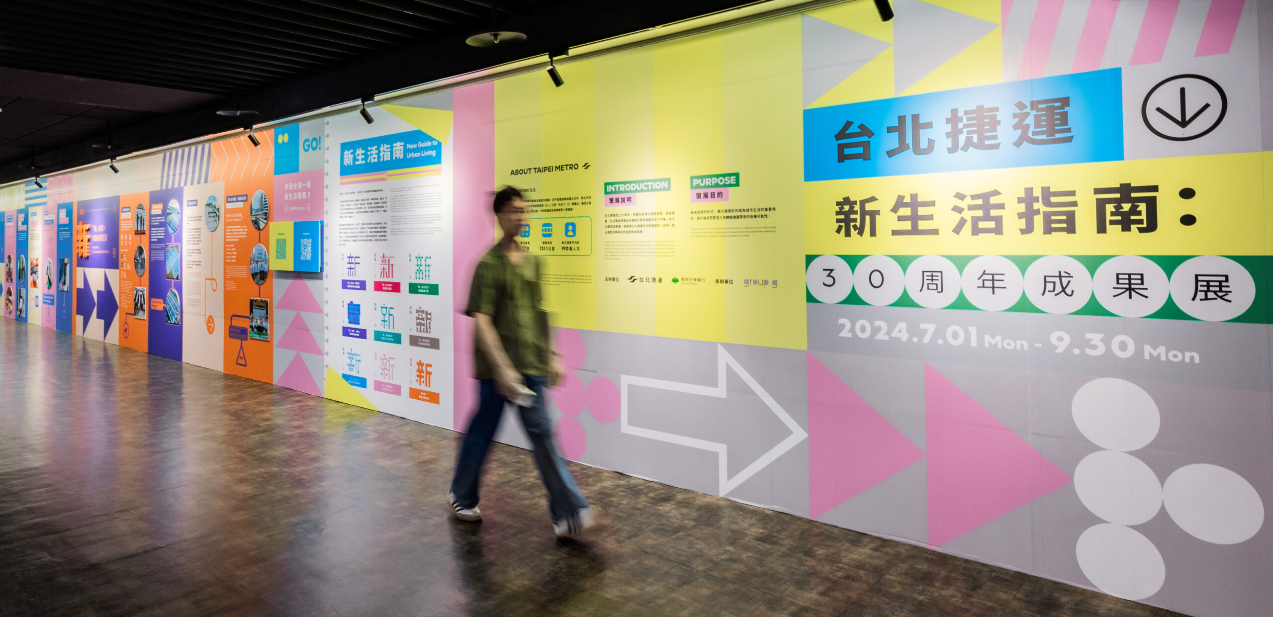
台北捷運|台北捷運新生活指南 The New Taipei Metro Guide
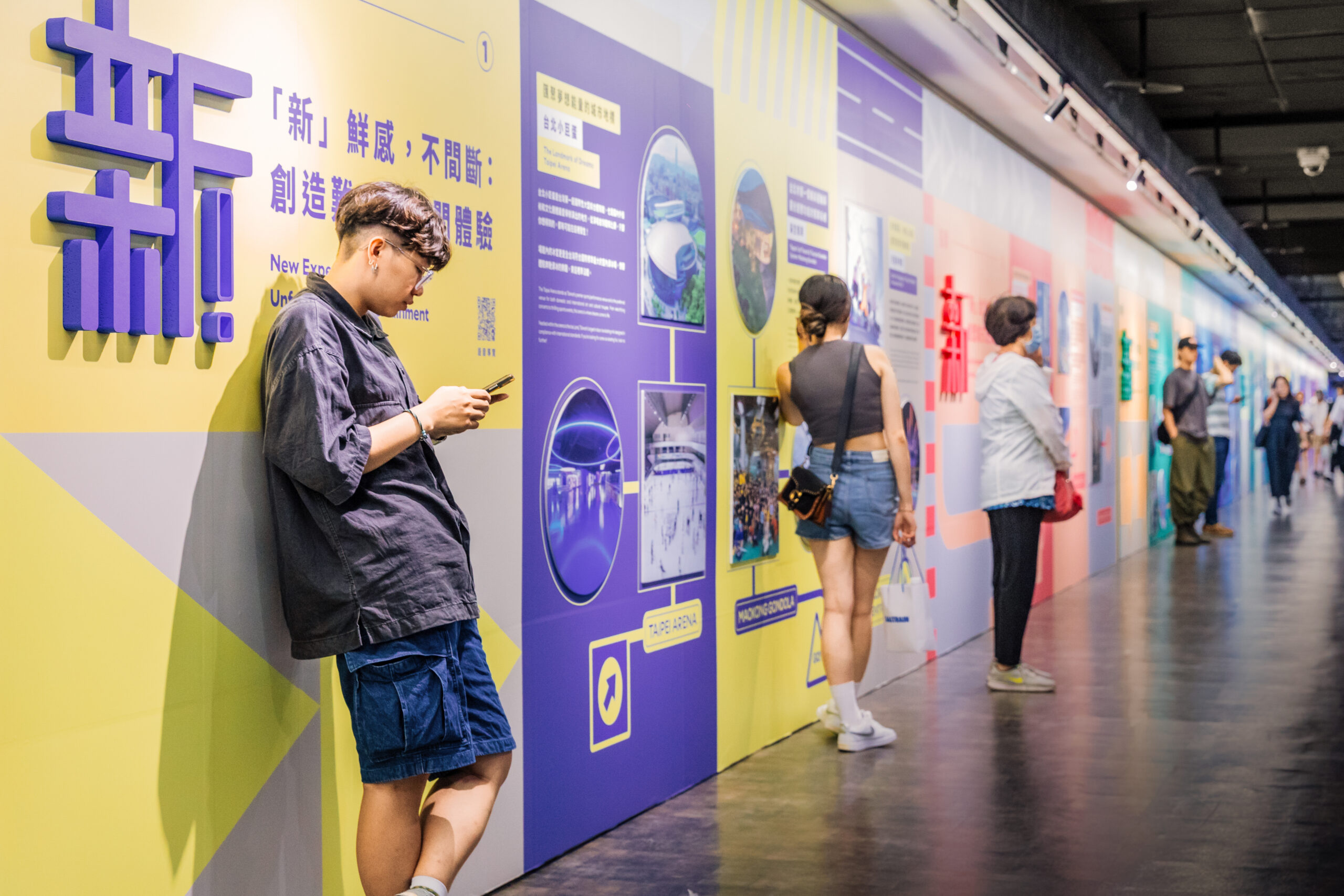
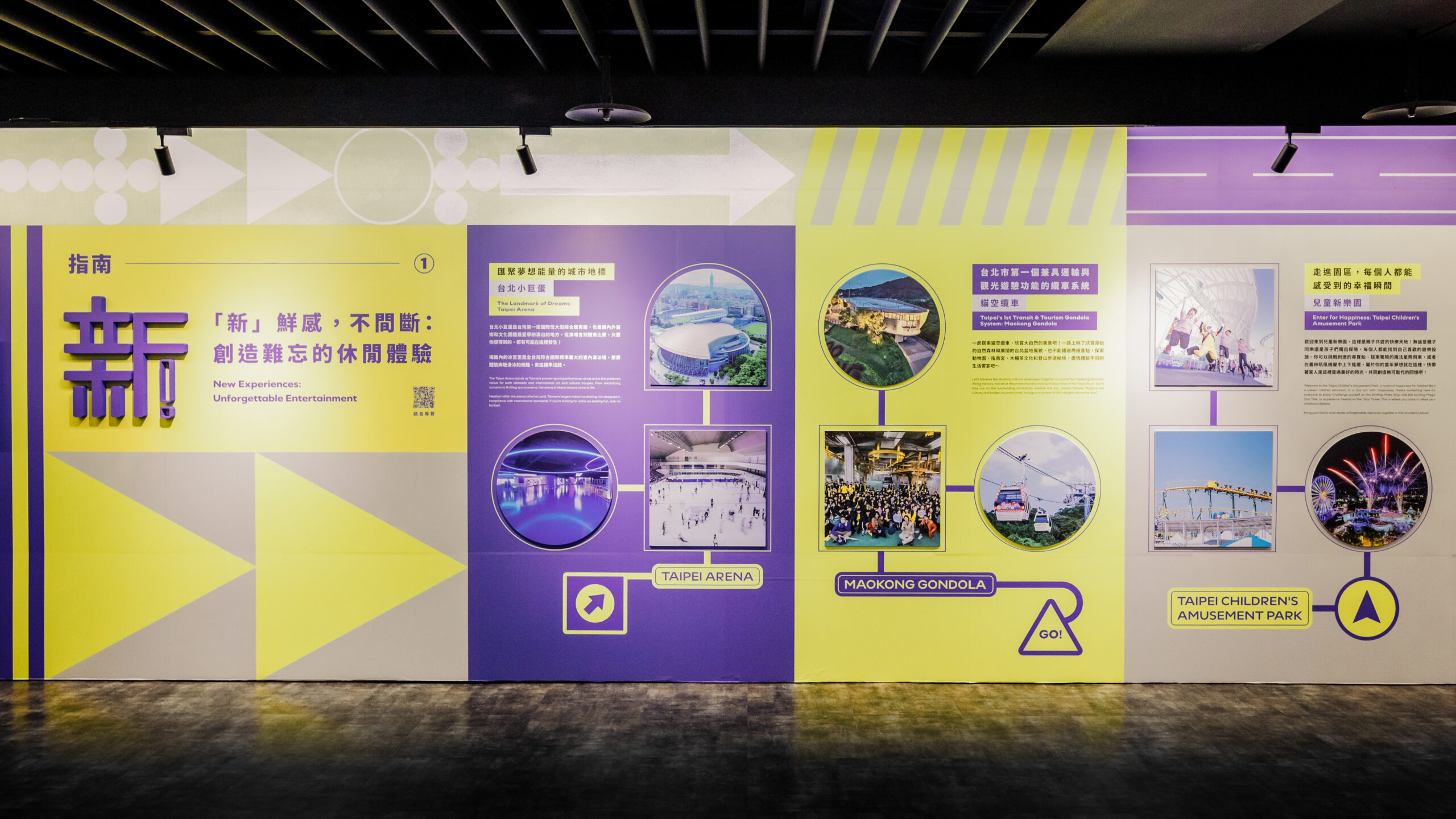
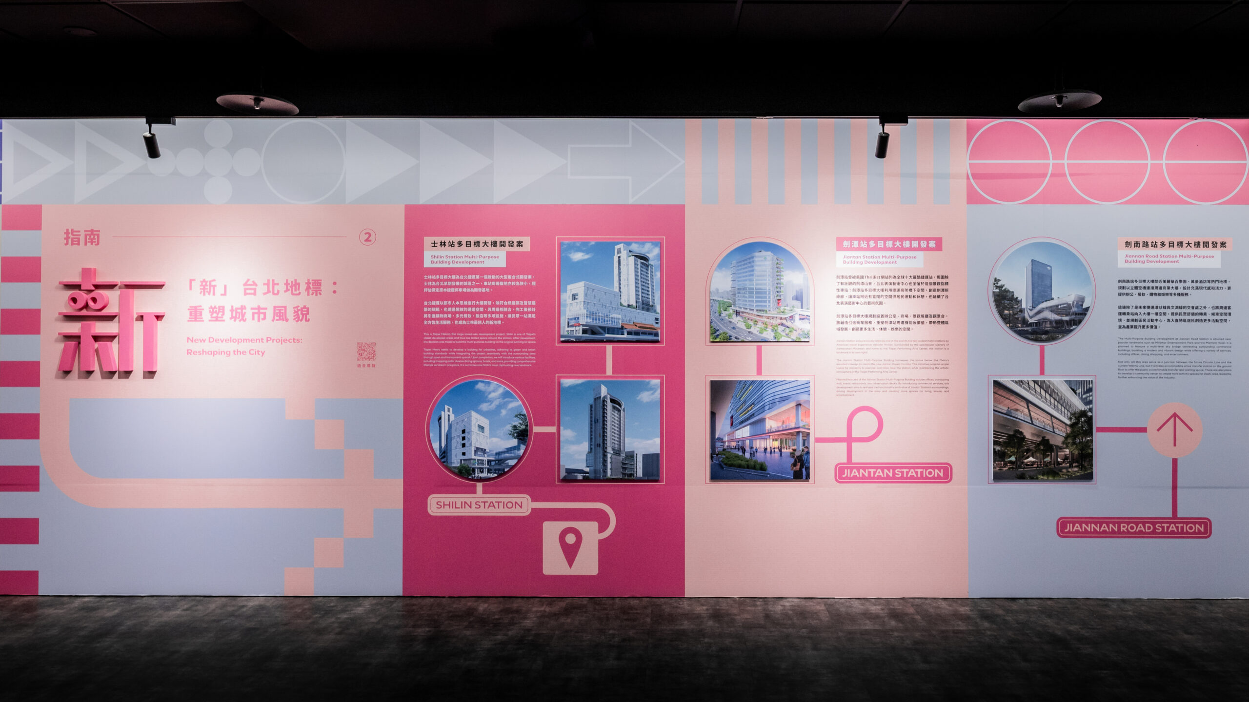
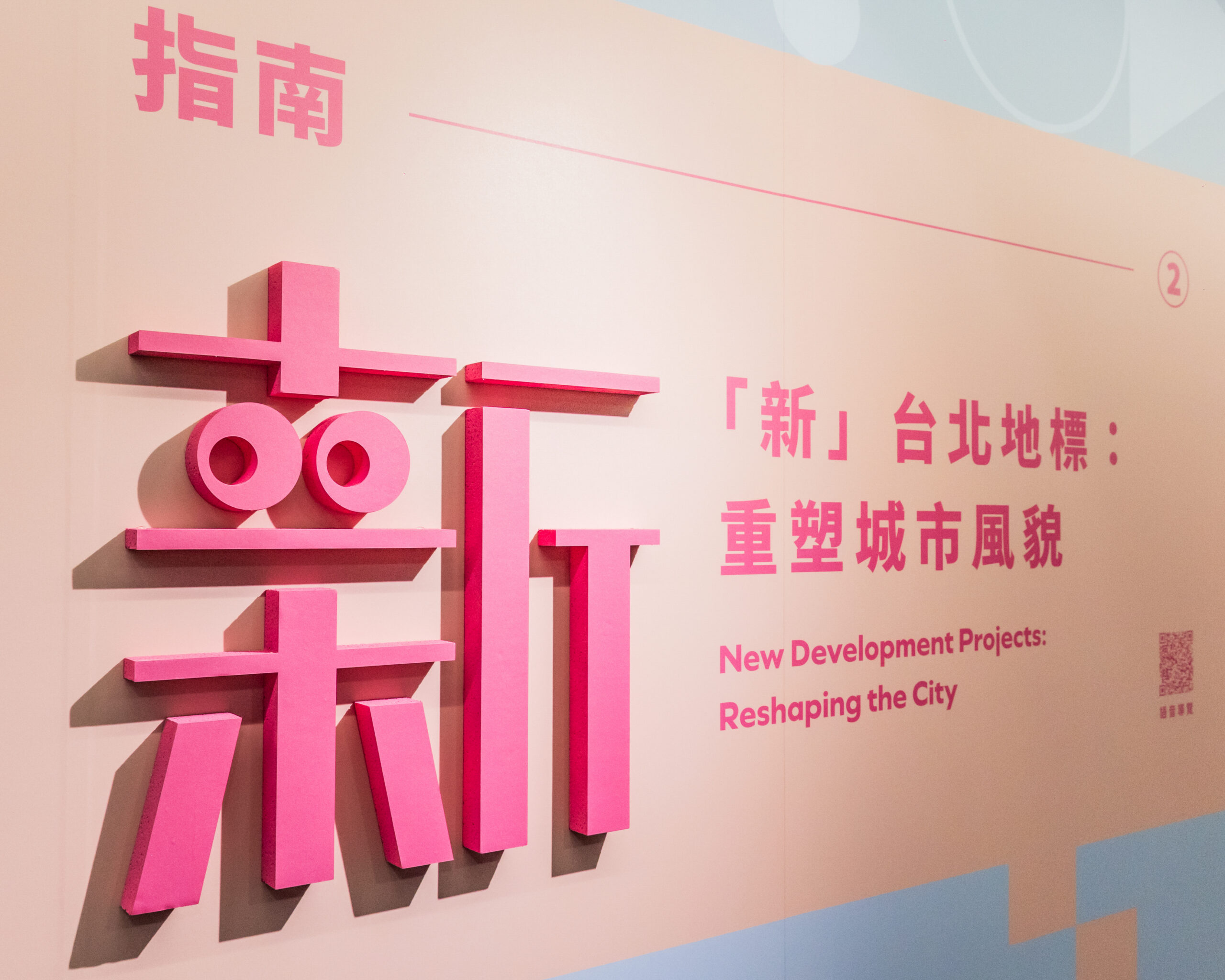
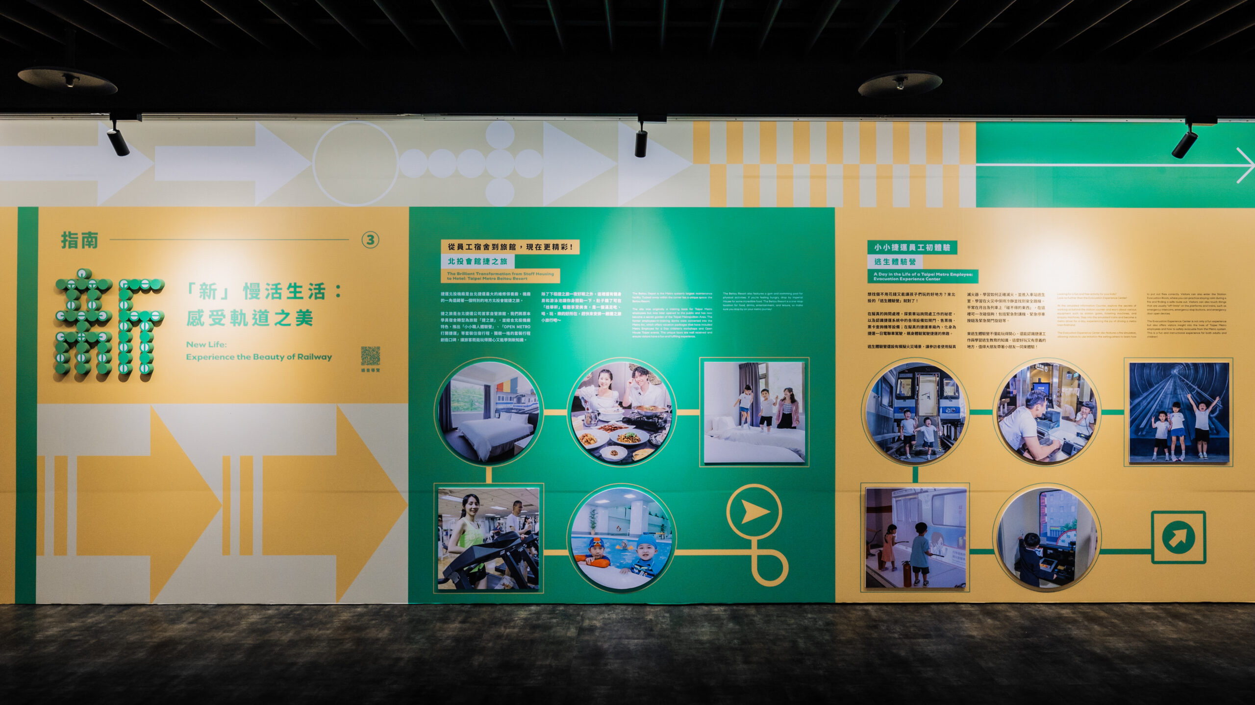
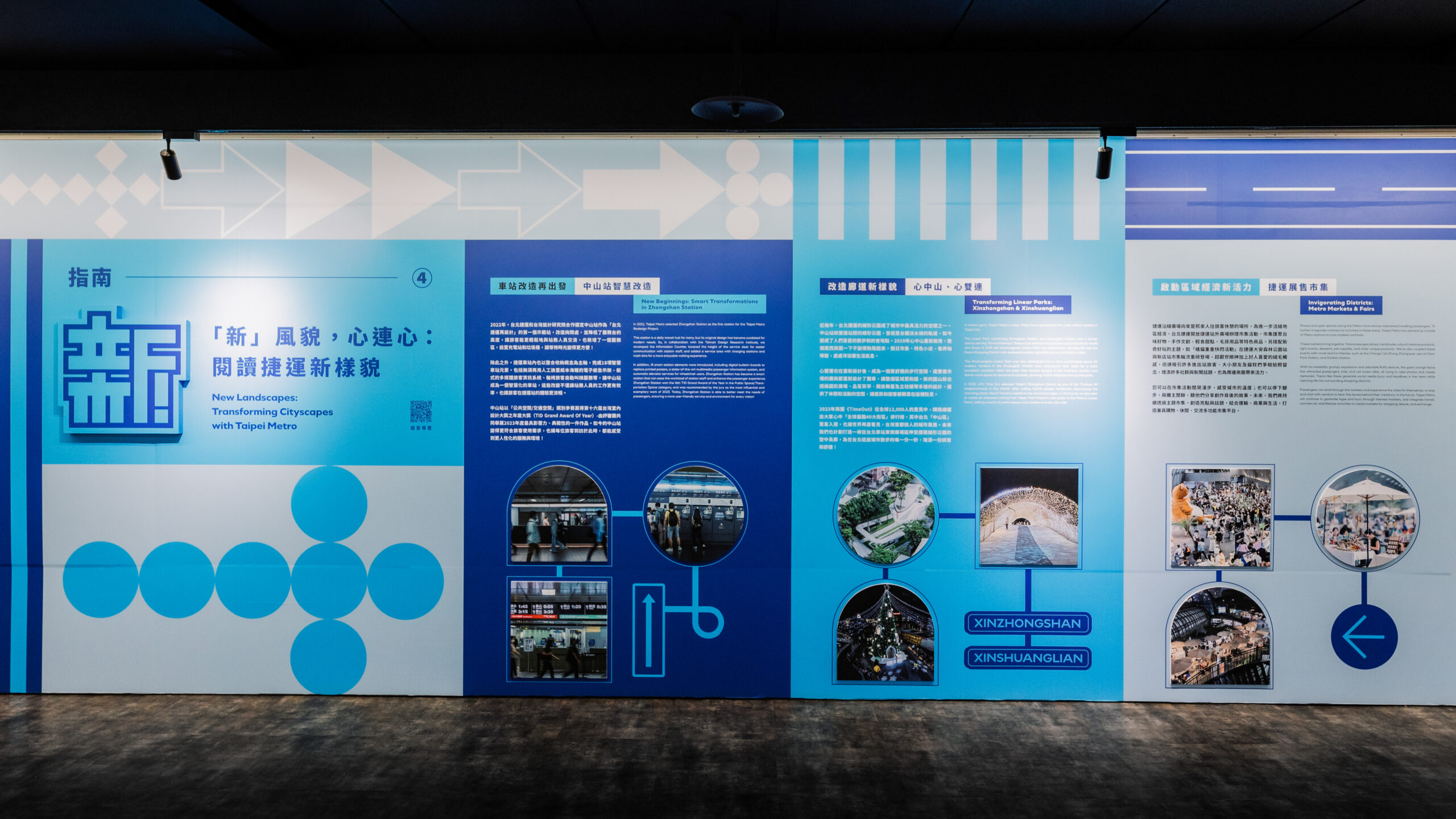
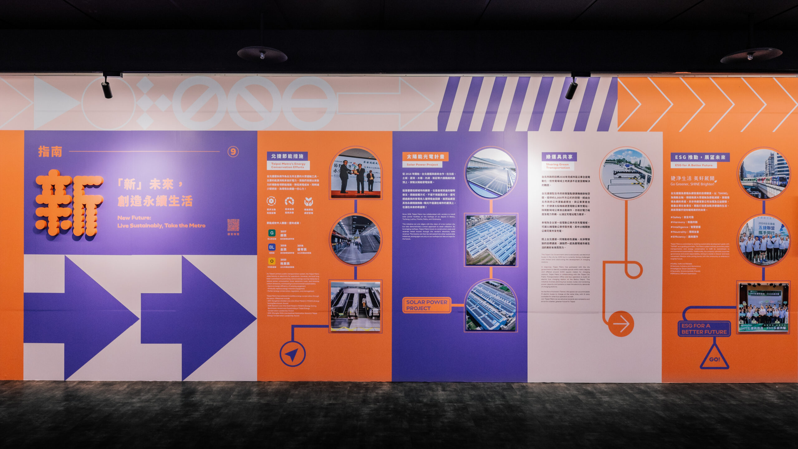
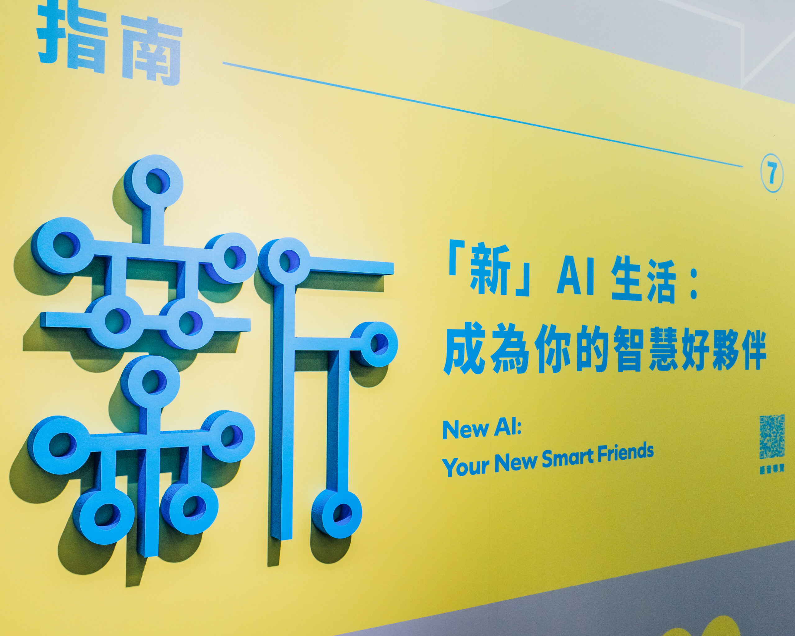
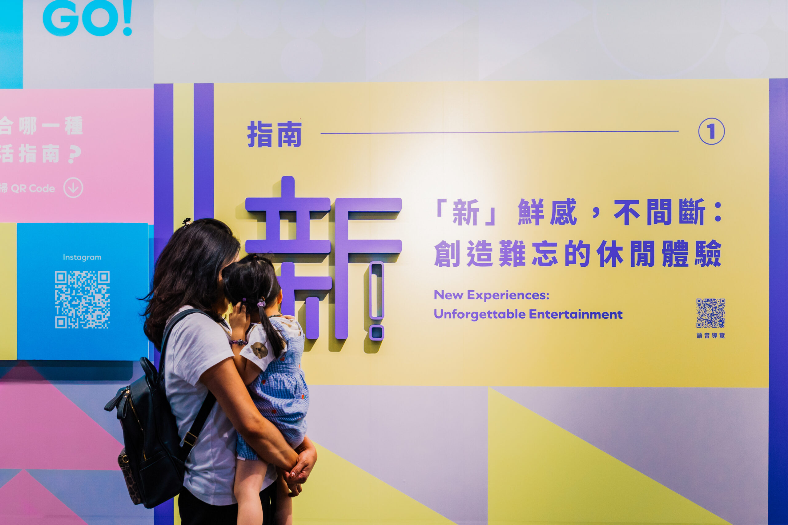
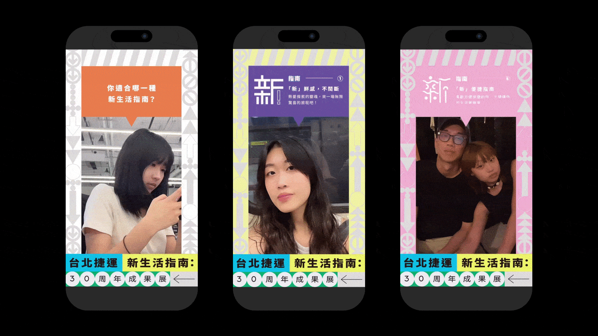
台北捷運成立30周年,以「安全」、「服務」、「品質」為主軸,持續在商業發展、遊憩休閒事業、新事業發展和永續城市等多個面向努力不懈。30周年成果展將以「台北捷運新生活指南」的方式,展示捷運如何串連城市各個角落,讓市民深刻體驗捷運帶來的各種可能性。
本次展覽不僅是對過去成就的回顧,更是對未來的展望。一同透過各種「新」指南,見證台北捷運如何透過不斷創新,打造更加美好的城市生活。
The Taipei Metro celebrates its 30th anniversary with a focus on “Safety,” “Service,” and “Quality,” continuously striving in areas such as commercial development, leisure and recreational industries, new business ventures, and sustainable urban development.
The 30th Anniversary Exhibition, titled “Taipei Metro: A New Guide to City Living,” will showcase how the Metro connects every corner of the city, allowing residents to deeply experience the diverse possibilities it brings.
This exhibition is not only a retrospective of past achievements but also a forward-looking vision of the future. Through various “New” guides, we witness how Taipei Metro, through continuous innovation, is shaping an even better urban life.
Year 2024
Client Taipei Metro
Contribution Offline Communication, Social Communication, Offline Events, Curation, Pop-Up Activation, Design

Key Visual Design

主視覺創意方向以路標指示為核心呼應本次展覽主題:新生活指南。運用幾何型創造出多樣的箭頭符號,象徵北捷多面向商業的持續發展。

Key Visual Design is centered around directional signage, aligning with the exhibition’s theme: “A New Guide to City Living.” By utilizing geometric shapes to create various arrow symbols, the design represents the Taipei Metro’s ongoing multi-faceted commercial development.

Challenge

展覽位於捷運中山地下街的中山藝文廊,場地全長約80公尺,兩側通道分別通往不同捷運站,參觀路線自由無固定動線。

The exhibition is held at the Zhongshan Art Gallery in the Zhongshan Underground Mall, spanning approximately 80 meters. With pathways leading to different MRT stations on both sides, visitors have the freedom to choose their route without a fixed direction.

Strategy


本次展覽充分考量了中山藝文廊獨特的空間條件,因場地沒有固定的參觀動線,展覽設計運用了豐富的色彩來區分各個展區;為呼應展覽的主題,設計了九種不同的「新」字,對應九個展版的內容,使得每個展區既獨立又互相關聯,視覺上更加鮮明生動。

此外,本次展覽同時也是對過去成就的回顧,因此視覺設計進一步延展了創意概念,以路標牌的形式將圖文巧妙串聯,引導參觀者在自由探索的同時,也能清晰感受到展覽所傳達的訊息。

This exhibition carefully considers the unique spatial characteristics of the Zhongshan Art Gallery. Since the space lacks a fixed visitor route, the design employs vibrant colors to distinguish each section. To align with the exhibition’s theme, nine different styles of the character “新” (meaning “new”) were created, corresponding to the nine display panels. This approach ensures that each section remains distinct yet interconnected, enhancing the overall visual impact.

Additionally, the exhibition serves as a retrospective of past achievements. The visual design further extends the creative concept by using signage to seamlessly integrate text and imagery, guiding visitors in their free exploration while clearly conveying the messages the exhibition aims to communicate.


Color Scheme

Font Design

Signage design

Exhibition Design

Instagram filter

Credits
Client| Taipei Metro 台北捷運
Creative Agency| Group.G
Curator| Sasa Fang Violet Lin
Account Executive| Leo Lin 
Creative| Pin
Designer| zhongyiwen PY Tsai
Executive Designer| 王芝婷
網頁設計| 趙珮妤
濾鏡團隊| 預算有限公司
Special thanks| Khiva Chuang